Visualizations for Linear Training#
The following visualizations relate to the linear form of the training. The sections For Instructors and For Trainees, respectively, describe the purpose and means of manipulation with the visualizations.
For Instructors#
Progress of Training Instance#
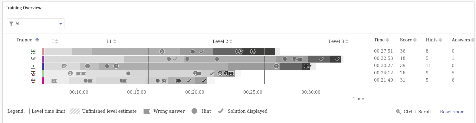
As an instructor, you can see the ongoing course of the training runs and further filter information on demand in the tab Progress. This tab contains two swappable sections - Progress and Command Timeline.
Progress#
Progress visualization is the main view of the ongoing training instance. It provides an overview of the trainees’ progress in the training - their current level, the time spent on the level and all events such as submitted answers, used hints or solutions. The x-axis represents time. On the y-axis, there are individual trainee playthroughs visualized by horizontal bars. Each horizontal bar is split into segments representing the time spent on each level.
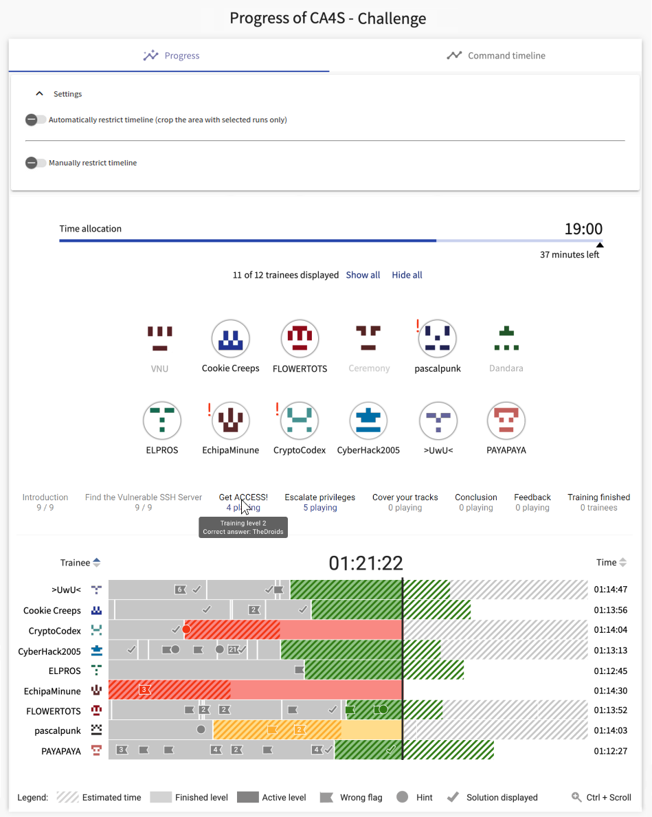
Levels bar
At the very top of the visualization, there is a line representing the levels of the training. Hovering over a level will highlight the respective segments of the trainees’ bars, allowing the instructor to quickly identify how trainees are progressing on a specific level. Clicking on a level will filter the visualization to show only the trainees currently on the selected level.
Sort
On the top left of the chart, there is a dropdown menu that allows the instructor to sort the trainees by different criteria. Direction of sorting can be changed by the button next to the dropdown. Sorting can be done by:
- Name: trainees are sorted alphabetically by their names
- Current level order: trainees are sorted by the ordinal number of the level they are currently on
- Current score: trainees are sorted by their total score
- Lag time: trainees are sorted by the time difference from the estimated duration of the current level
- Lag time percentage: trainees are sorted by the percentage ratio of their current lag time and the estimated duration of the current level
- Training run start time: trainees are sorted by the time they started the training run
Lag behind schedule
If an estimated duration for a level is specified in the training definition, the progress visualization can also show whether trainees are lagging behind the schedule and how they are faring compared to the estimate. The estimated duration is visualized by a diagonal dashed bar. If a trainee is lagging behind the schedule, their progress bar will transition from green to yellow and then to red. If a bar is red, the trainee may require the instructor’s attention. Lastly, after a very long time spent on a level, the bar will turn black. This means the trainee has completely stopped progressing (or is inactive).
Lag states are also summarized in a legend at the top of the chart. The legend contains all possible lag states:
- On track: the trainee is progressing according to the schedule.
- Warning: the trainee is slightly behind the schedule and may require attention in the near future.
- Late: the trainee is behind the schedule and may require immediate attention.
- Not progressing: the trainee has stopped progressing for a long time and may require immediate attention.
- Unknown: the estimate is not available for the level
Tip
Clicking on the legend will toggle the visibility of the respective lag state in the visualization. This allows the instructor to focus on specific lag states and identify trainees that may require attention.
Trainee legend
On the left side of each trainee’s bar, there is a legend with the trainee’s name and image. By clicking on the trainee’s name, the instructor can pin the trainee to the top of the list. This allows the instructor to easily track the progress of specific trainees. To clear all pinned trainees, click the “Clear” button at the top of the legend.
Timeline
At the bottom of the visualization, there is a timeline, matching the x-axis of the main chart. The timeline can be used to zoom in on a specific time period. To zoom in, drag the end points of the timeline to the desired time period. A zoomed in view can be dragged by the slider at the bottom. To reset the zoom, click the “Expand” button on the left of the timeline.
Events
Events are represented by small circles on the trainees’ bars. Each event corresponds to an action taken by the trainee. Events are positioned on the bar according to the time they were recorded. The color of the event corresponds to the type of the event. There are 4 key event types:
- Wrong answer submitted: the trainee submitted an incorrect answer for the current level
- Correct answer submitted: the trainee submitted a correct answer for the current level
- Hint taken: the trainee revealed a hint for the current level
- Solution displayed: the trainee revealed the solution for the current level
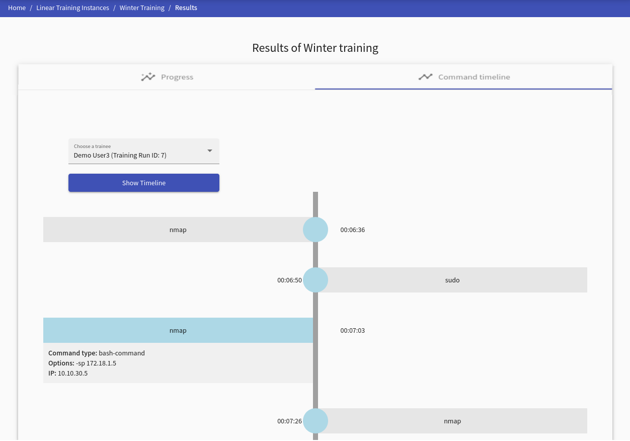
Command Timeline#
This visualization provides commands ordered by the time of the selected trainee. Every command contains the detail of its usage and when it was executed. More precisely:
- Command type: represents a command type, e.g., a bash command.
- Options: states the option(s) used for the command, e.g.,
nmap -h. - IP address: the IP address from which the command was entered.
Note
Displayed time is a timestamp from training, not real-time.
Results of Training Instance#
The page provides all collected data about the training instance in several tabs.
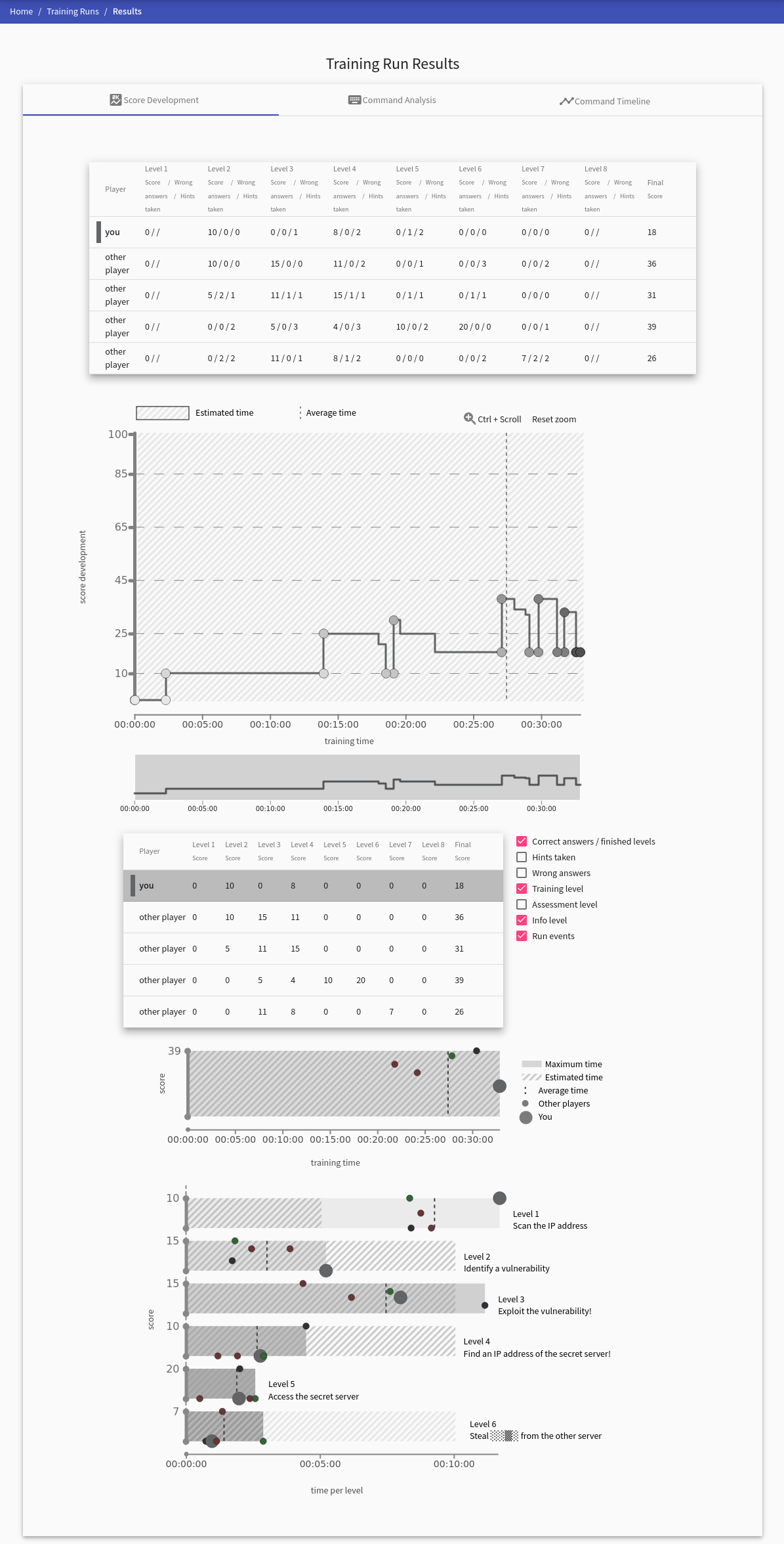
The Dashboard tab, which is always present, contains Score Development, Score Scatter Plot, and Progress overview graph. These graphs provide various views on trainees’ activity in training. Next to the dashboard tab is the Assessment tab. Command Analysis tab is present if any commands were collected.
Dashboard#
This visualization unites the previously listed visualizations and provides interactions between them. Visualization filters allow the instructor to filter the available training events and the format in which the trainee selector displays the trainees. The trainees selected by the trainee selector are then shown in the Progress overview graph. The instructor can filter which trainees they want to see in visualizations by this option. Their results are displayed in the progress overview graph upon selecting these trainees. Selecting trainees in the progress overview graph will appear in Score Development and Score Scatter Plot. Hovering over a trainee in any visualization will highlight them in the remaining visualizations.
Score Development#
The tab displays a graph with the time development of the trainees’ scores marked in the table under the graph. The graph also displays various types of events (denoted by a small circle). To visualize events taken by trainees, check/uncheck a checkbox displayed next to the table with participants. Hold Ctrl + Scroll while scrolling with the mouse wheel to zoom in or out.
Score Scatter Plot#
This visualization provides an overview of the training results. It helps to compare the score and duration of the whole training or individual levels. Dots show the positions of the trainees based on score and time. They indicate the correlation between the two factors and help to pinpoint the outliers or allocate clusters.
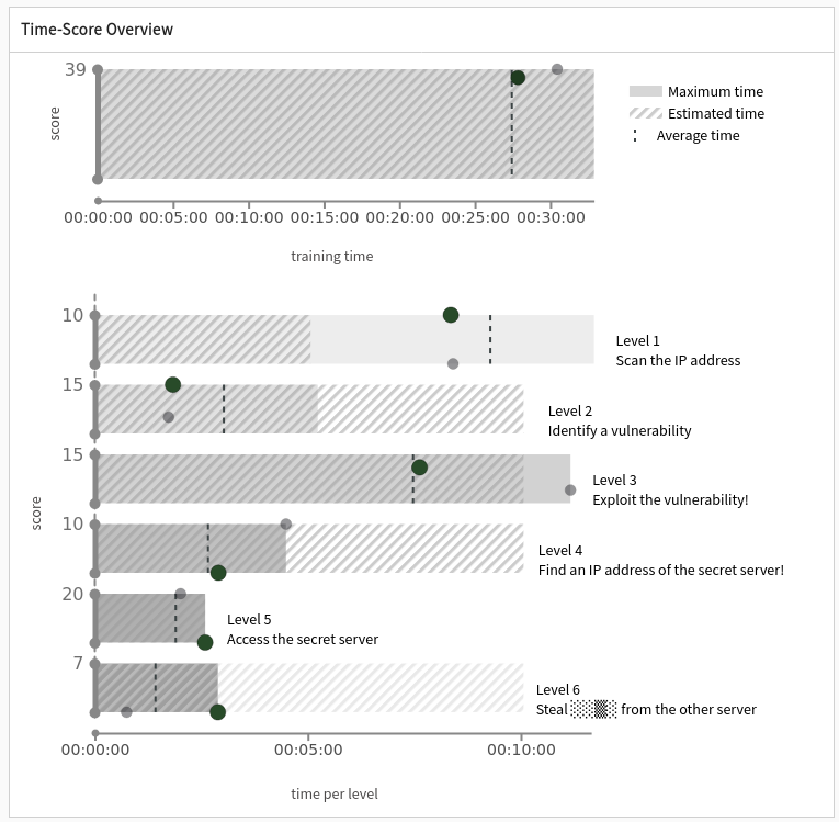
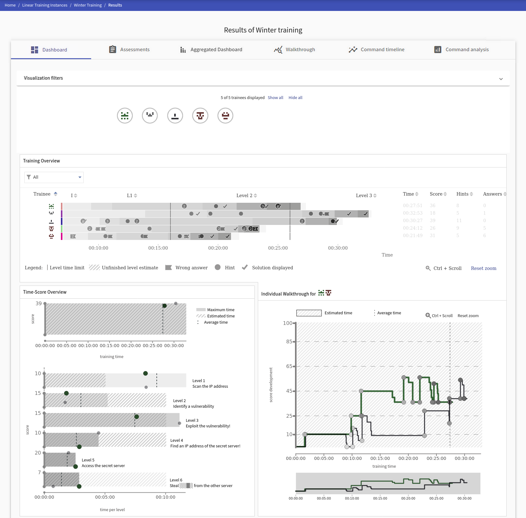
Final Training Runs View#
This visualization is a view on available data distilled from the “Progress of Training Instance”. It supports additional interaction (such as level sorting by their duration) and gives a full picture of the trainee walkthrough. The color scale helps to highlight individual levels for all trainees as well as their usage of hints or submissions of wrong answers for the levels. It helps to find skilled trainees or flaws in the training design by observing the details of its progression.
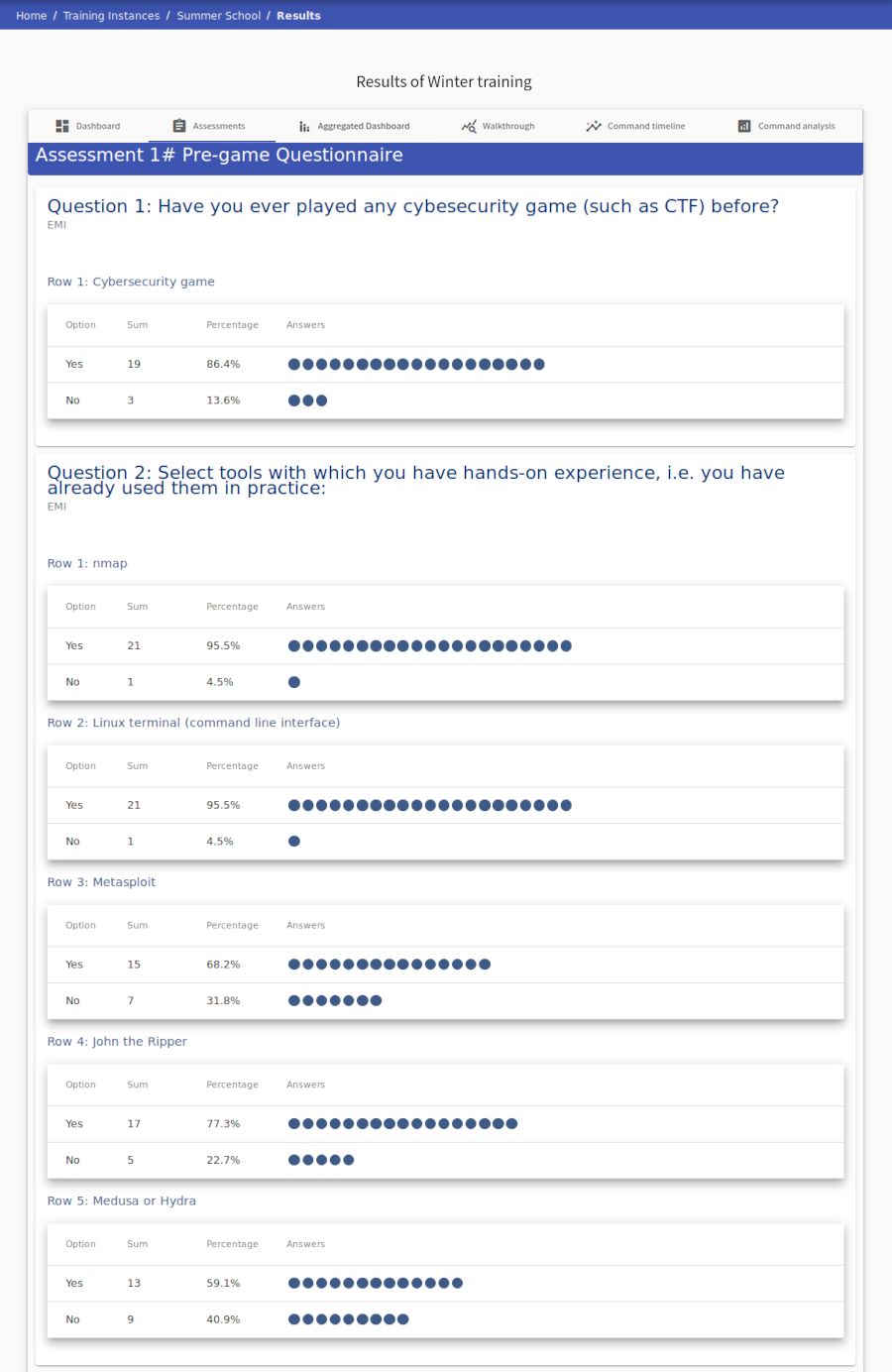
Assessment#
Displays statistics of individual assessment answers.
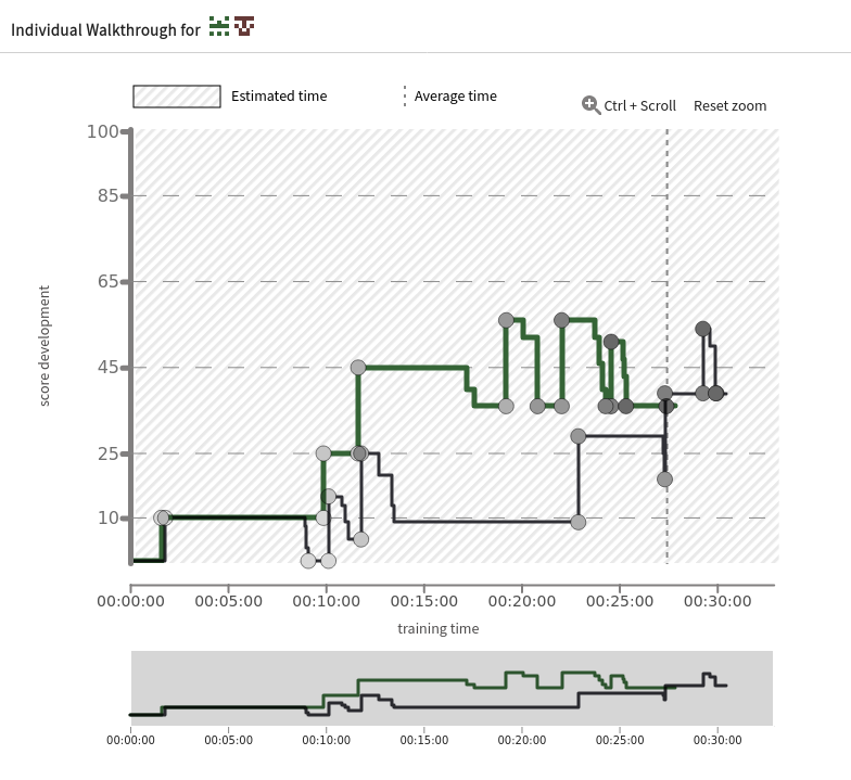
Walkthrough#
A tab called Walkthrough transforms the data of each game phase into visualizations that provide a quick overview of relative success rates. Each curve corresponds to one player, whose ID is shown on the far left.
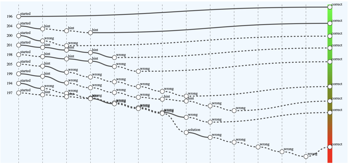
The x-axis captures important game events that are interpreted as either a successful step towards solving a task (e.g., using the correct command or entering the correct answer) or, conversely, a “failed” step (e.g., displaying a hint). This interpretation is reflected by an increasing (successful step) or decreasing tendency of the curve. Players are ranked according to the outcome. The color scale on the right visually distinguishes successful players (shades of green) from less successful players (shades of red) in this relative comparison.
For clarity, some events (points on the curves) are aggregated. When you hover over an event, details are displayed. A solid curve indicates that some sandbox commands were used between game events. Hovering the mouse over a curve will display a list of them. A dashed curve indicates that no commands were recorded between events.
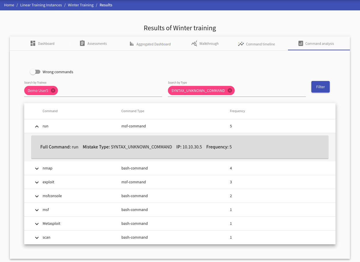
Command Analysis#
This visualization provides an analysis of commands for a selected trainee. Commands are divided by their correctness (correct, wrong) which can be changed with a slide toggle button at the top left side of the panel tab. Each command record contains the following detailed information:
- Full Command: represents the whole command with options, e.g.,
nmap -A -T4 scanme.nmap.org - IP: IP address of the machine in the sandbox from which the command has been executed
- Frequency: states the number of occurrences of this exact command
Correct Commands
Analysis of the correct commands requires choosing at least one trainee in the instructor’s view. Otherwise, the table will be empty.
Wrong Commands
Analysis of the wrong commands specifies the error type of the command. These error types are divided into seven categories based on the syntax (five categories) or semantic error (two categories). At least one error type must be selected to display the wrong commands. Also, at least one trainee must be selected in the instructor’s view.
Warning
The selection must be confirmed by the Filter button.
For trainees#
After trainees finish a training run, a set of visualizations of their behavior is displayed in tabs. Tab Score Development contains Score Development, Score Scatter Plot, and table of other trainees. Since the trainees should decode all information easily without further guidance, the interface is straightforward.
Furthermore, if there are any commands collected, the following tabs are displayed: Command Analysis, Command Timeline.